Scrapbook
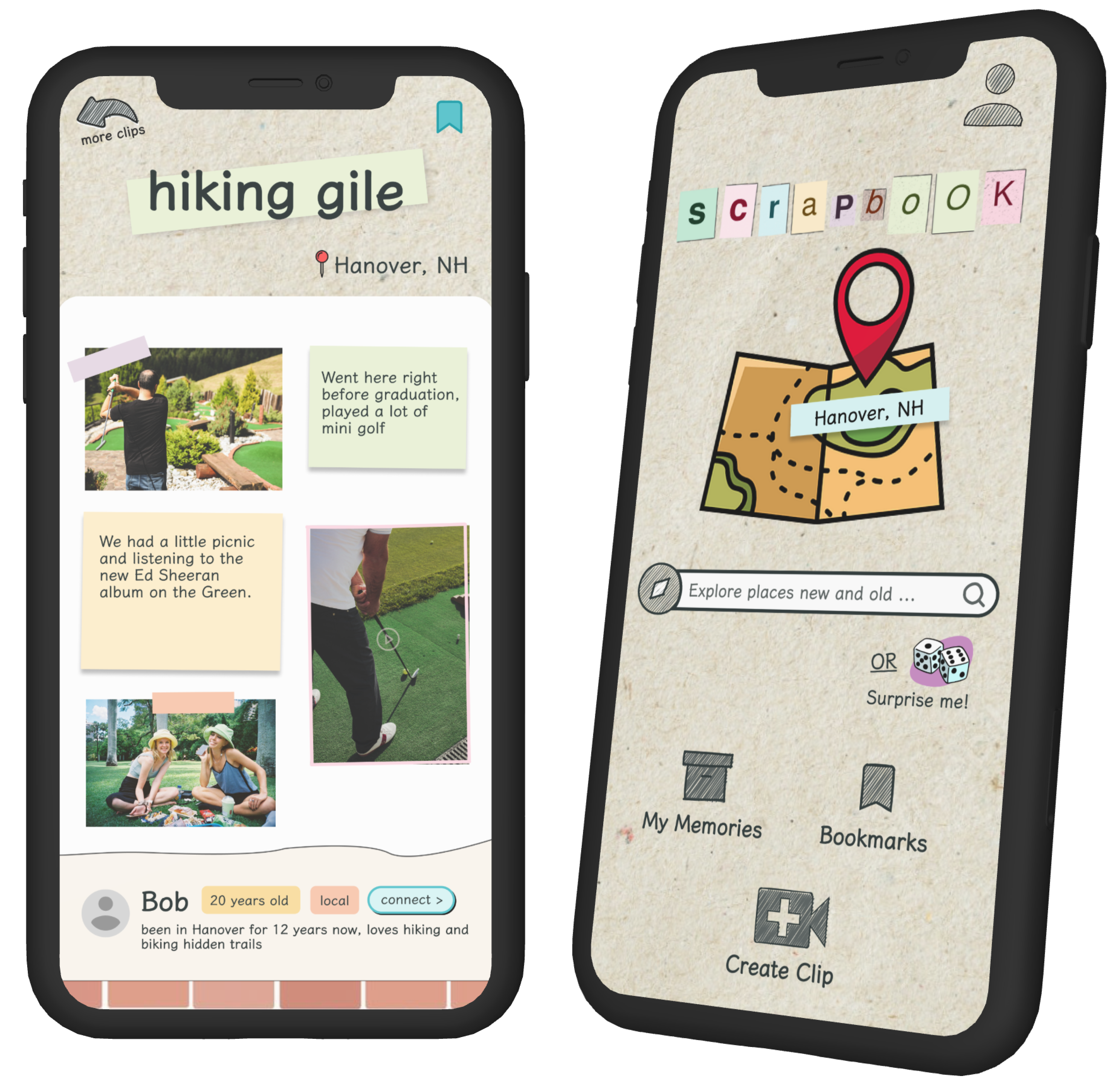
A pocketable, community scrapbook for clips of your day-to-day adventures.CONTEXT
CS 25.01 Final ProjectTEAM
Nitya Agarwala Ishita Singh
TIMELINE
2 weeksSKILLS
User Research, UX Design, UI Design, PrototypingDELIVERABLES
Mobile application prototype Style guide
THE PROBLEM
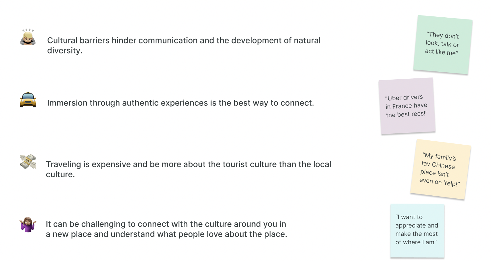
Making Authentic Connections as a Traveller
THE OPPORTUNITY
How Might We
Help people easily share and appreciate their cultural experiences and engage with others’ ?THE SOLUTION
A Mobile App
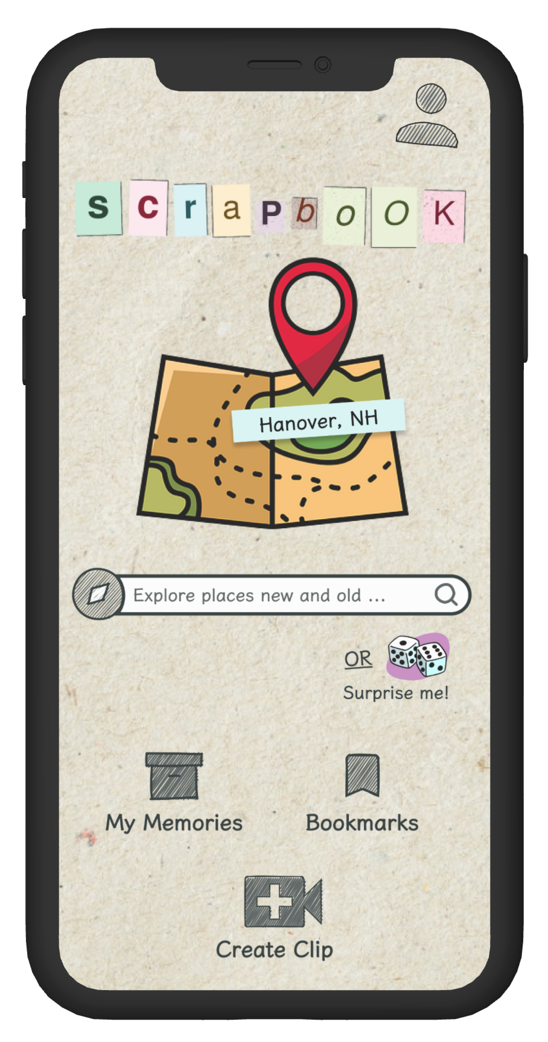
Scrapbook
A pocketable, community scrapbook for clips of your day-to-day adventures. We're a repository of special memories from locals & travelers.Combining old school scrapbooks & modern short-form content
Finding adventures
We organised everything by lists, making it easy to filter and search for clips. We also avoided the infinite scroll, we really want users to click on each clip and take the time to explore people’s scrapbook memories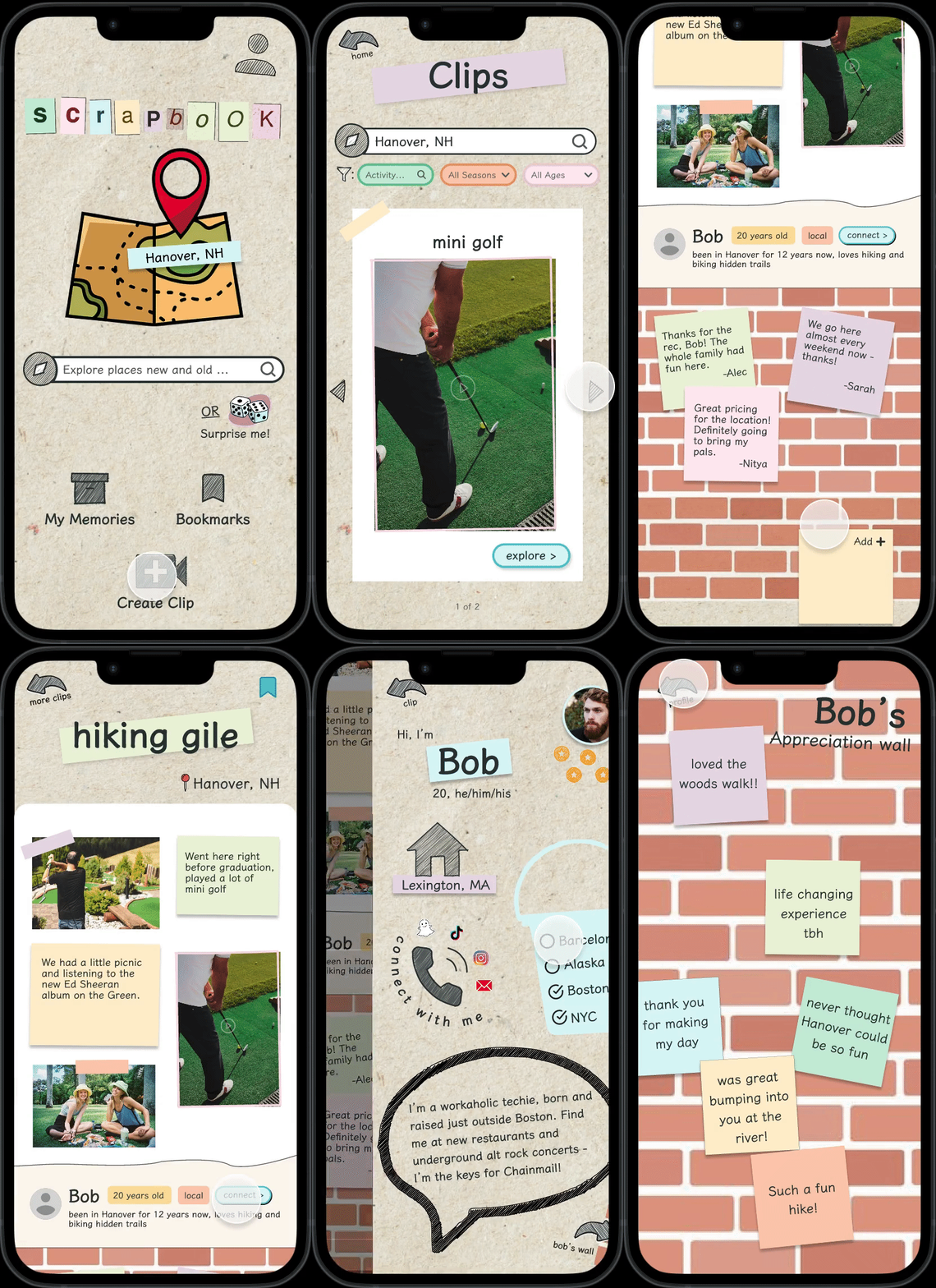
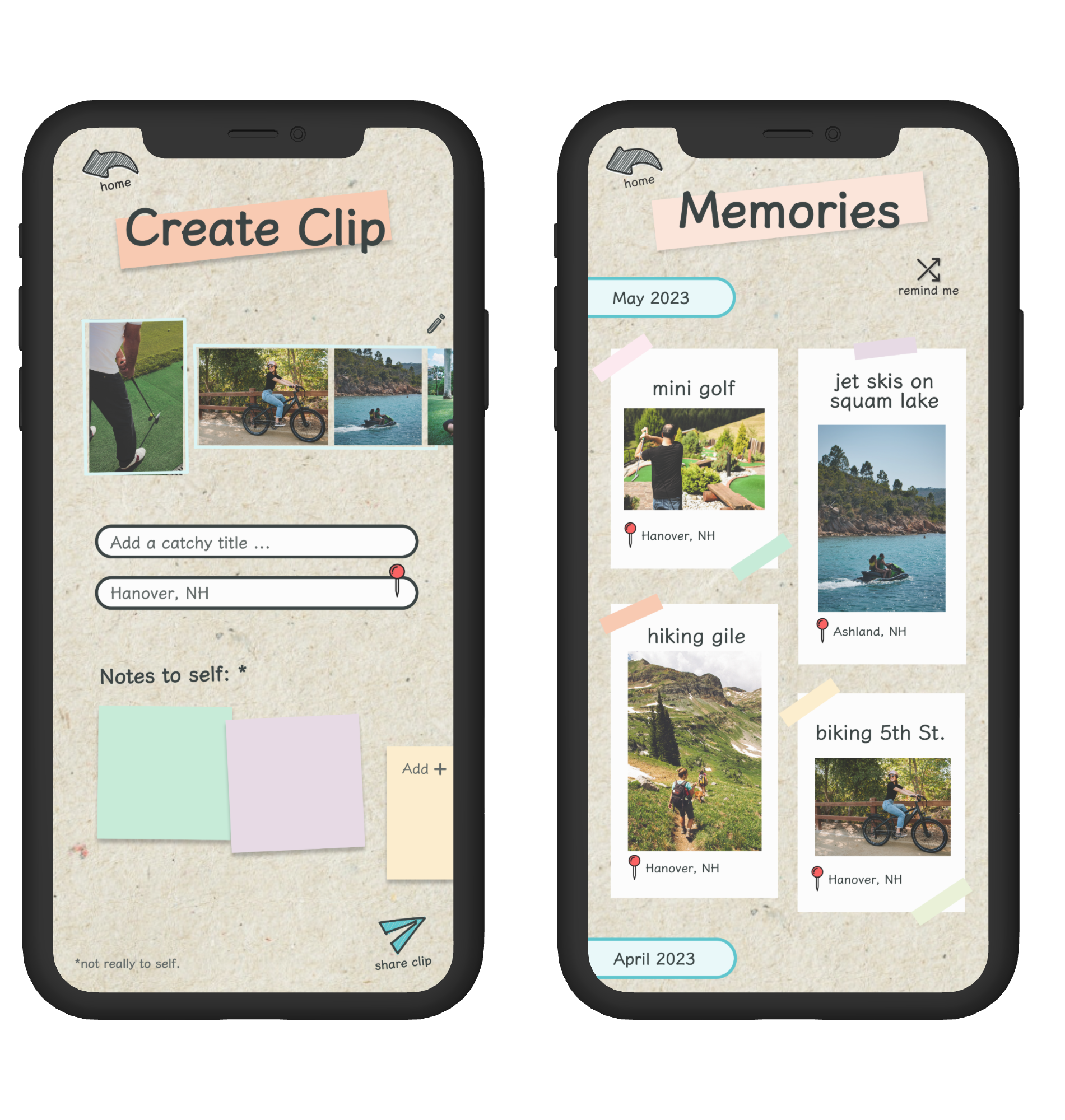
Creating and sharing clips
Encourages people to share their culture around their hometown by creating and sharing scrapbook clips. Adding clips is a mix of short form videos, gallery images and sticky notes– a real momento of the places that are special in your culture without being time-consuming to create.The Design Process
From user interviews to market research and our testing process, our ideas changed a lot through the course of this project! Here's how we created our product.RESEARCH
User Interviews
Given the prompt: connecting across generations and cultures, we conducted 8 in depth interviews with Dartmouth students, ranging from students who travelled often and loved exploring other cultures, to students who had studied abroad and those who struggled to connect with other places.To organise our findings, we created detailed empathy maps for each user interview.

Key Insights
We learned 3 main things from our 6 user interviews.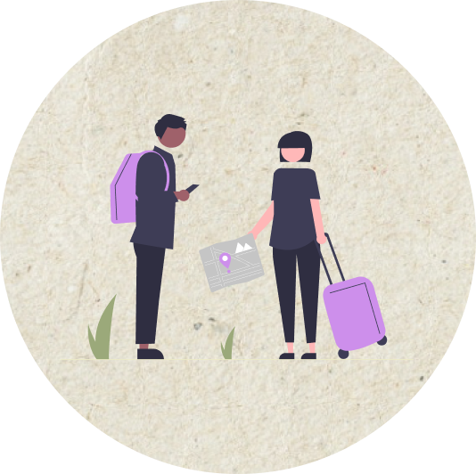
Authenticity vs Branded Tourism
People tend to stray away from branded tourist experiences because they focus on sightseeing not really exploring the “culture”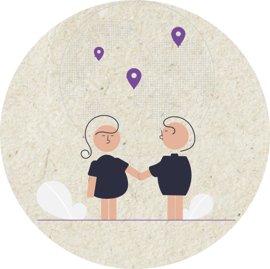
Finding the Best Places
The best spots in people’s hometowns are not always on Yelp, the places connected to their culture and their special memories are things they can only share in a more personal way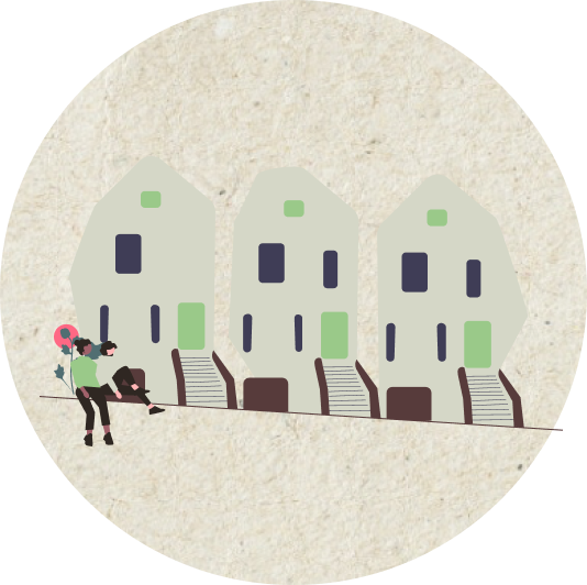
Engaging With People’s Lives
People get more out of travel when they immerse themselves in locals’ lives, such as going to an art class or having everyday experiences and picking up on cultural differences through thatDEFINE
Personas & Journey Maps
Based on our interviews, we decided to focus on these three insights and improving the experience of connecting with other cultures through bringing delight to these aspects of the experience.To further empathise with our user, we created a user persona:
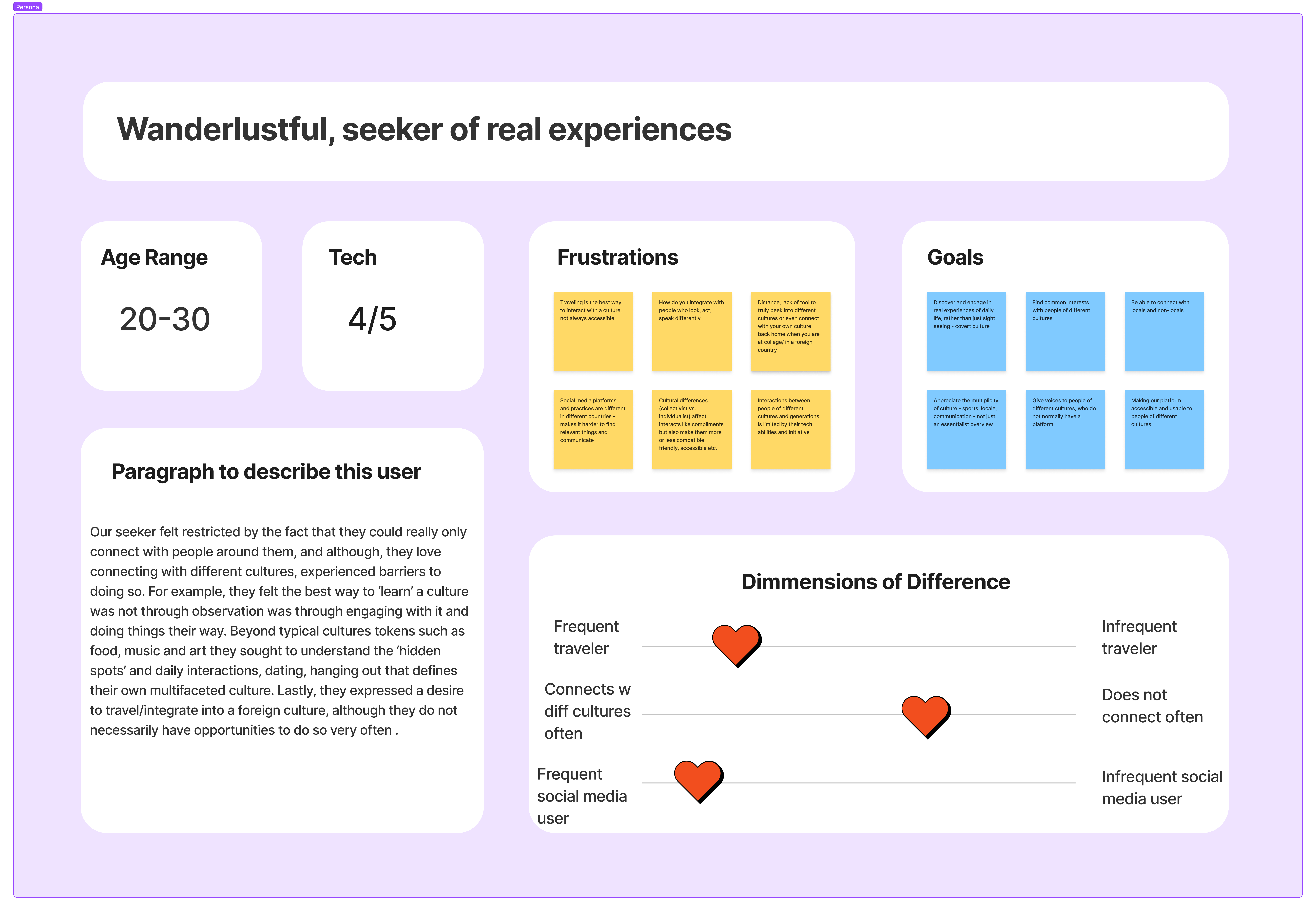
We then created a journey map to understand the pain points and opportunities for delight in the user’s journey
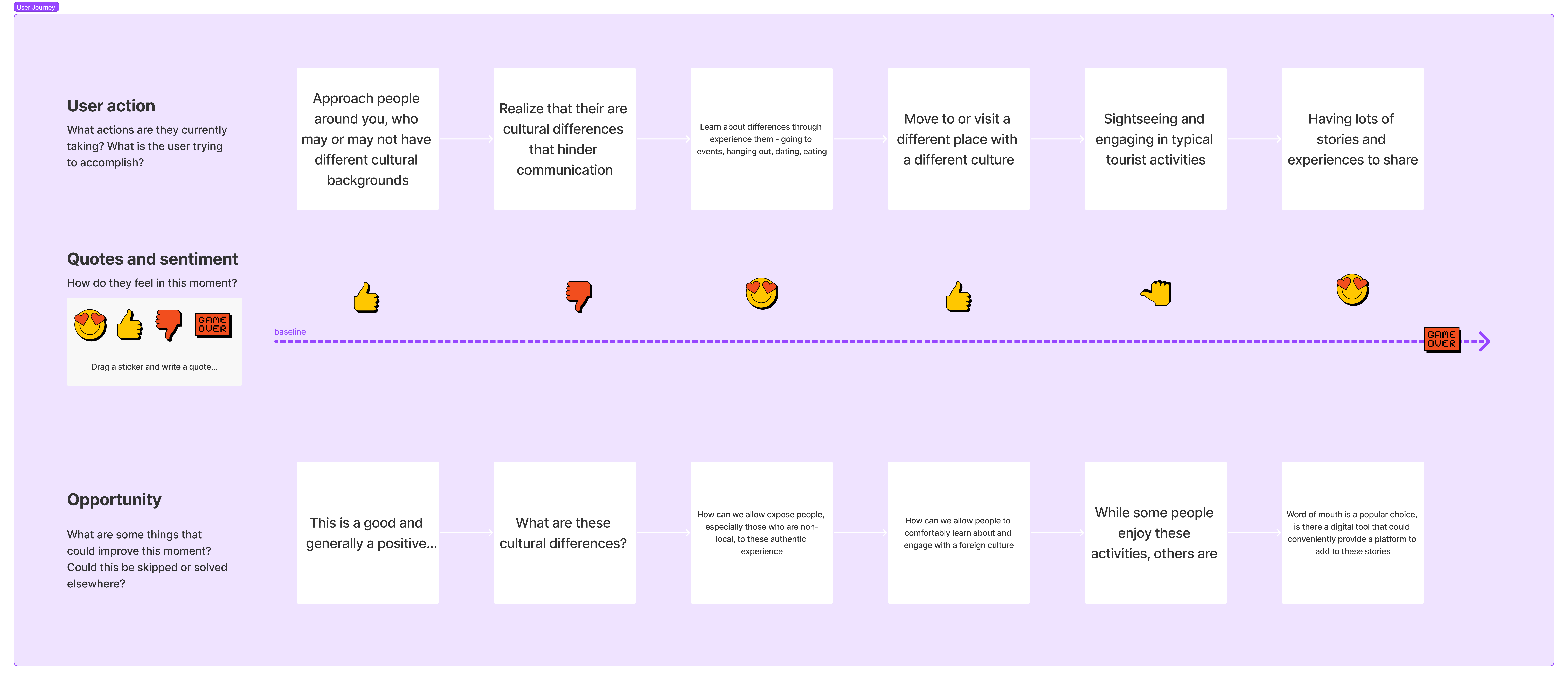
POVs & Needs
We then defined some needs for our user group based on their journey.
We decided to focus on the part of the journey where people are searching for ways to connect with different cultures and looking a friendly guide or inspiration. We wanted to provide a platform for users to be able to be exposed to different facets of people’s lives from different cultures.
IDEATE
How Might We
To help in the process of ideation, we came up with a few how might we questions to guide our brainstorming.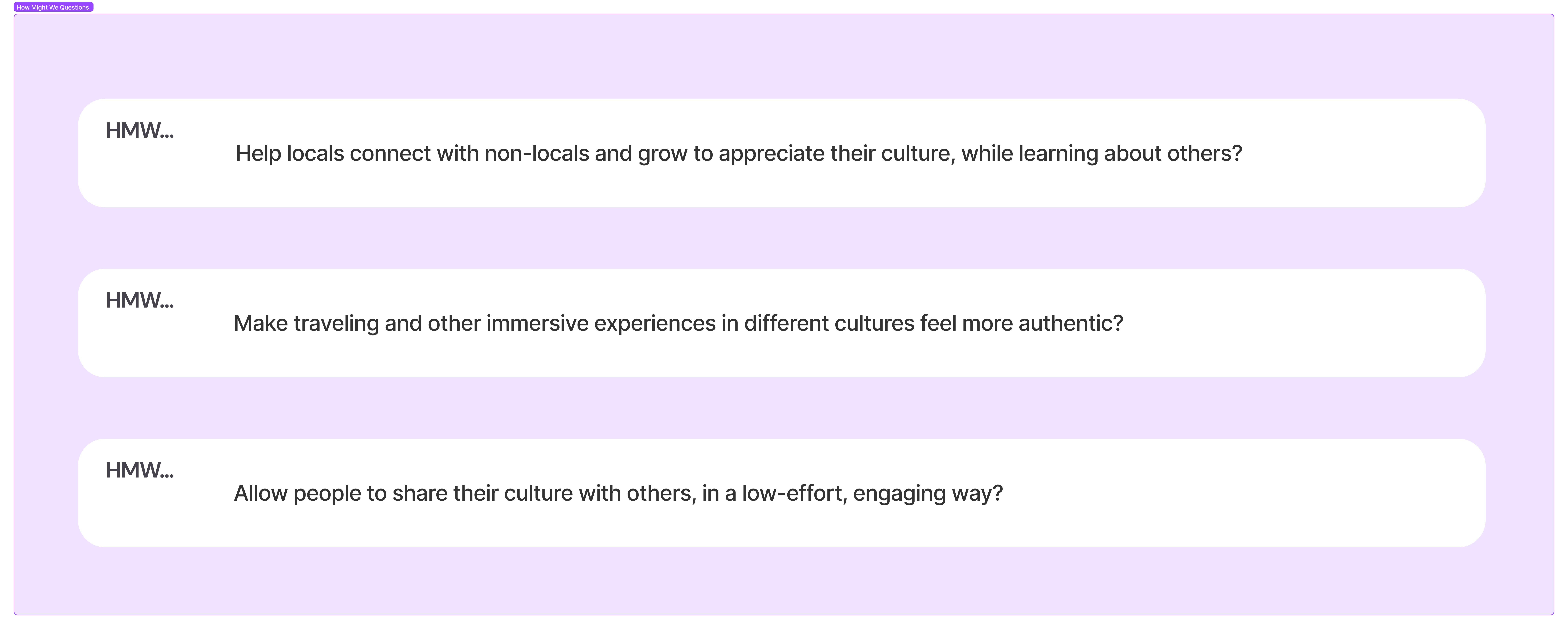
Brainstorm
After our first whiteboard brainstorm and seeing different directions we could go in, we realised that part of what could make travel experiences more authentic was taking people back to their childhood and special, deep memories, contained in scrapbooks.These could help spotlight some of the deeper connection with places and their culture that tourism loses. We could try to encourage people to share their culture of their hometown and explore other ones through real experiences of people local to the place.
With this idea, we made some crazy 8 sketches to brainstorm features that could be useful and delightful in such an app.

After discussing each of these as a team and asking for some user feedback on what users would like to see, we decided to prioritise this list of key features:
- Homepage with a search by location
- Surprise me: to find new locations
- Displaying clips by locations with search and filters
- Individual clip scrapbooks: ability to connect with people through them
- Profile pages
- Appreciation walls: for people to leave appreciative notes on experiences they loved
- Bookmarked memories with filters to find what you need
- My clips: sorted by date
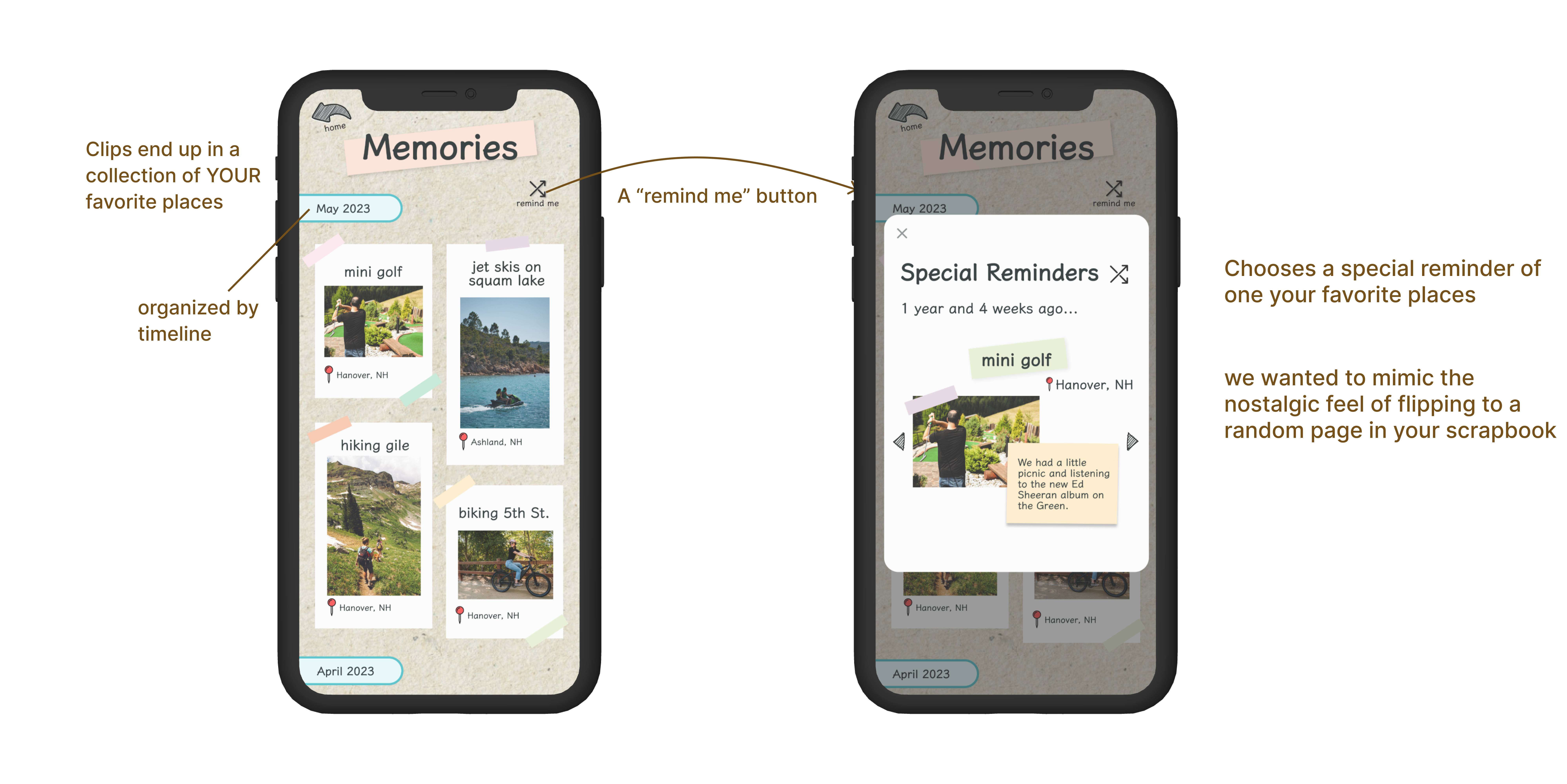
- A shuffle/memory of the day for my clips
PROTOTYPING
Low Fidelity Grayscales
To experiment with alignment, hierarchy and usability on our screens, we converted our sketches to greyscale mockups. We tried different ways to navigate the app without it being confusing to perform different tasks and different ways to make the interface engaging but not addictive.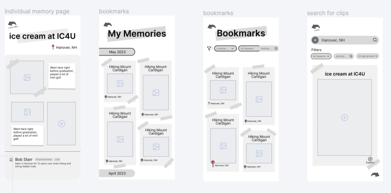
We took our favourite iterations from our user-testing into our high fidelity prototype.
PROTOTYPING & TESTING
High Fidelity Prototypes
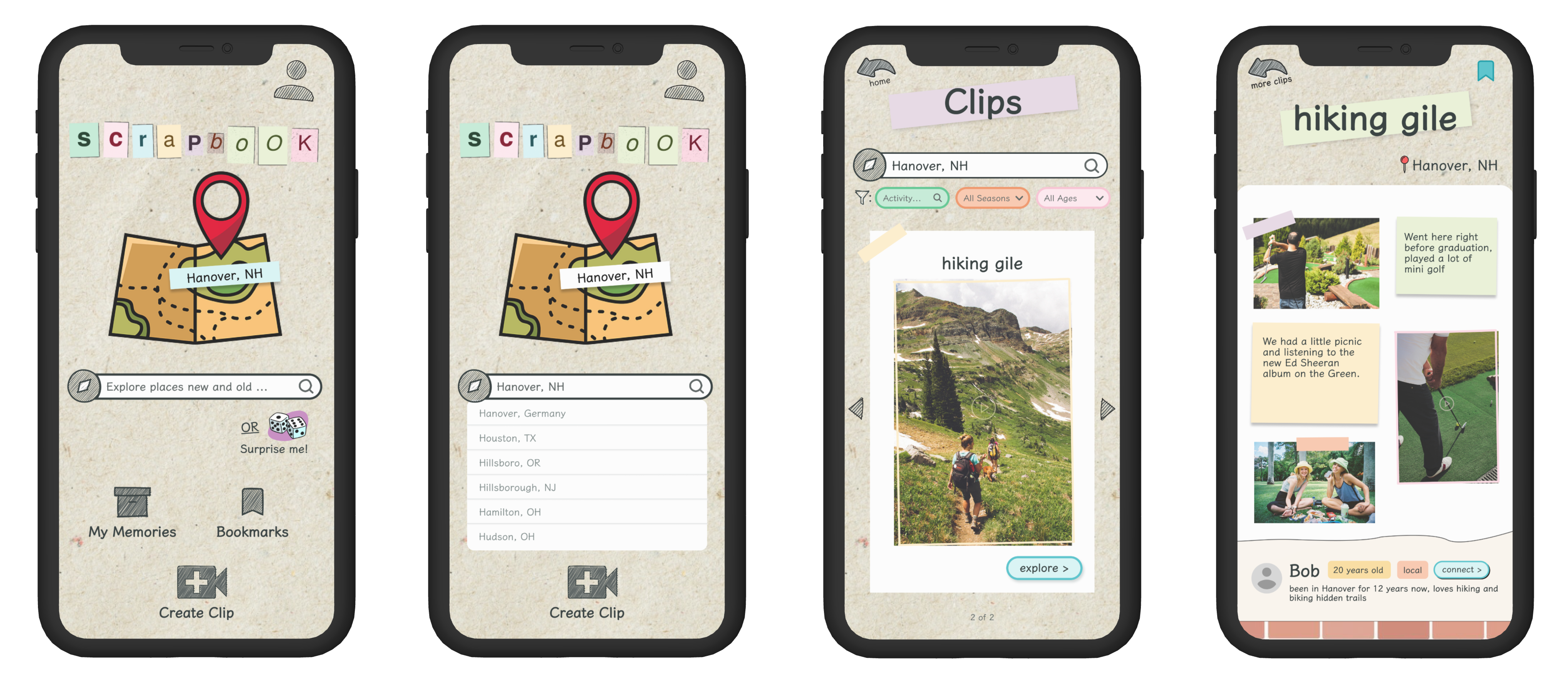
Searching for a clip
The main purpose of our app is to make it an easy experience for users to find activities and local spots in a new place.To this end, we crafted carefully thought out filters for our search page. The primary search is by location, however users can then narrow in on activities they like, seasons they are planning to visit in and what age group’s activities they might connect best with.
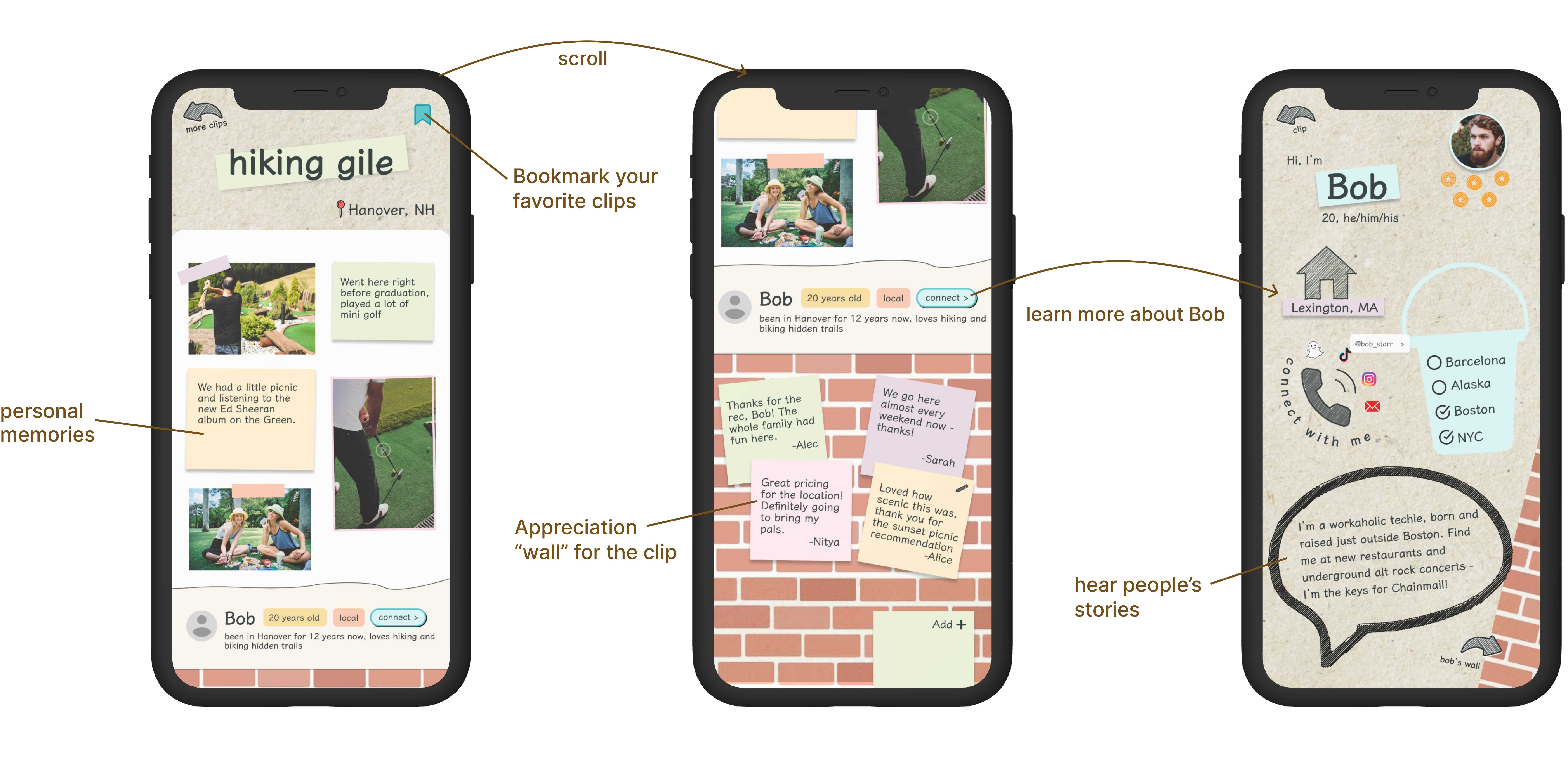
Clips & walls
Each clip is crafted with personal connection in mind. You see personal memories and anecdotes from the creator as your browse and understand why this memory is important to them.You also see personal stories and anecdotes from people who engaged in the activity
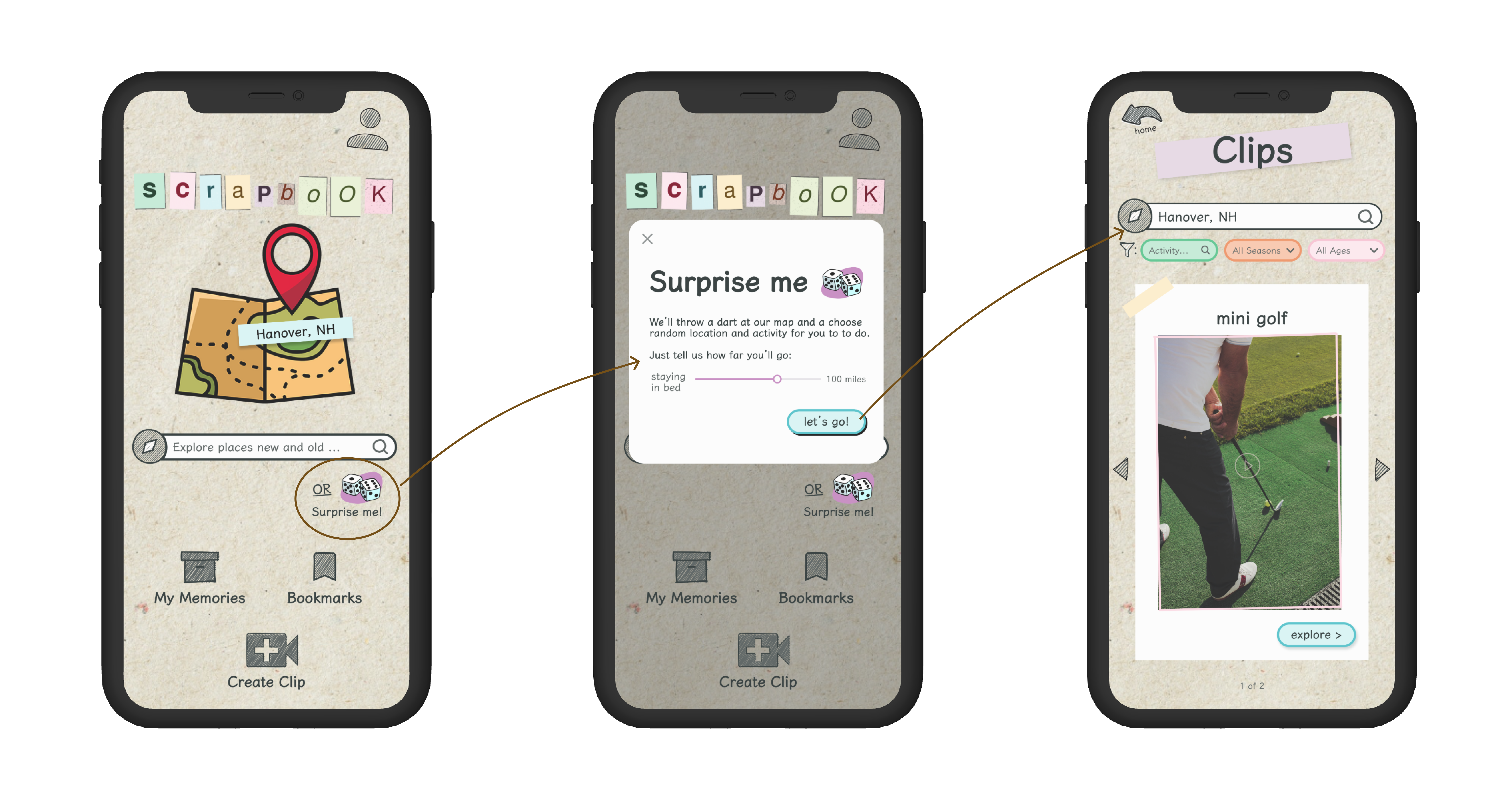
Surprise me
For the more thrill seeking population we interviewed, we added a surprise me modal. It takes you to a random clip from a random location within your preferred distance; a place you may not even know exists, but whose culture you can now explore.This slider was added after much deliberation on what was non-negotiable to someone looking for adventure. We decided on driving distance because travel time came up as one of the biggest factors from our interviews especially for people planning something spontaneous.
Creating A clip
This flow focuses on creating a memory that is special and detailed without too much effort or time-consumption. We incorporated multimedia while keeping the traditional scrapbook experience alive.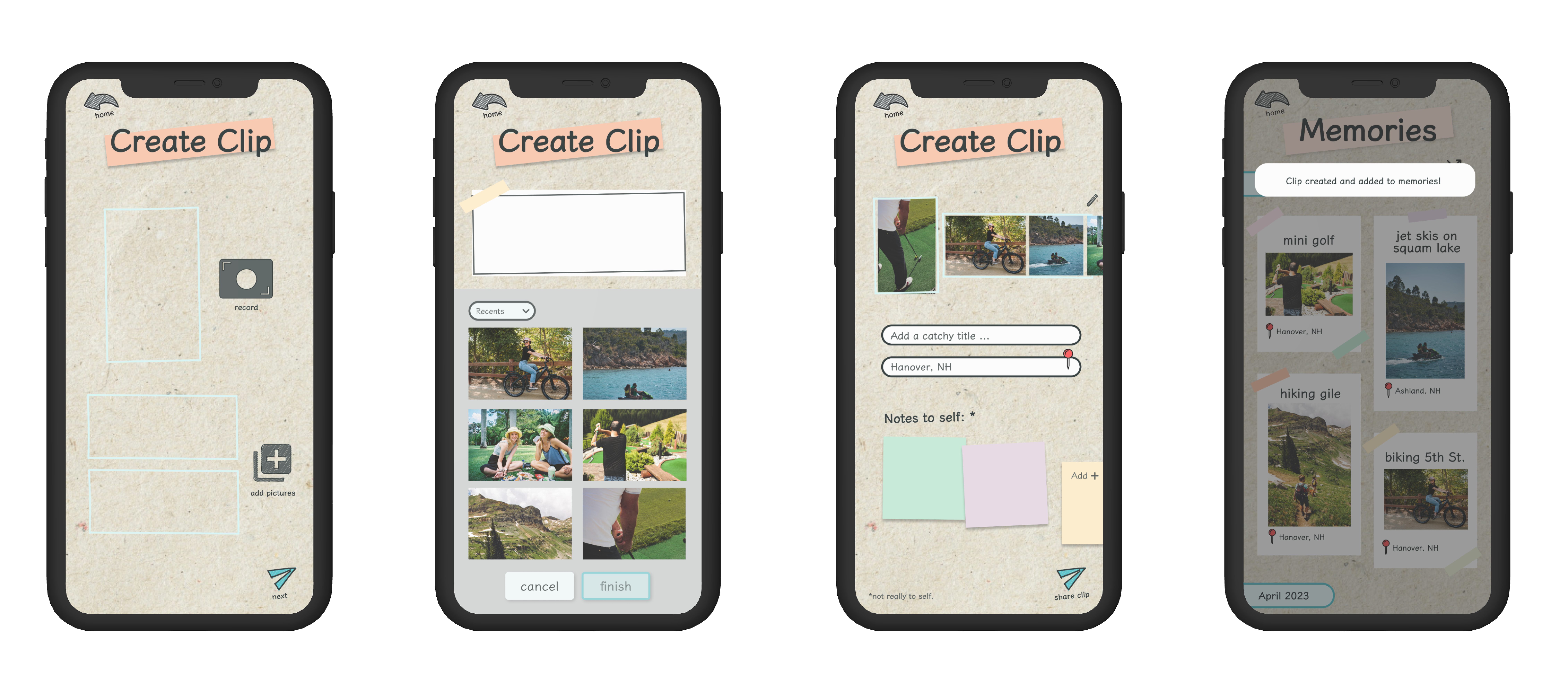
TESTING
Feedback & Insights
1. Confirmation Modals
From our user testing, one of the biggest takeaways was that users were unsure whether clips had been created and confused by the navigation following that page. This lead us to add more confirmation popups, reassuring the user that the task had been completed successfully.2. Intuitive Terminology
Hearing users go through the app and use terms like ‘clip’, ‘explore’, ‘digital diary’, etc. to describe elements of our design inspired us to incorporate some of those terms into our branding. Why not use the labels users intuitively come up with instead of choosing different ones for them to get used to.3. Nostalgic Scrapbook Feel
The overwhelming positive feedback that we received from users was that they were pleasantly surprised with the realism, creativity and nostalgia that our UI provided. We worked to further build on this design by adding both decorative elements and additional, editable screens with the same theme.ITERATION
Takeaways and Next Steps
We created Scrapbook to bring delight to those looking to connect with other cultures and to help them bring inspiration from real, everyday memories of people from around to world, local to a diverse range of cultures into their experience.From users who loved the old school feel of the UI, transporting them back to their special scrapbook days, to those who expressed that they would constantly use the surprise me feature and drive to recommended, random places to experience a memory from the book of a stranger and fulfil their thirst for everyday exploration, we received so much positive feedback.
Our testing also inspired us to ideate future directions for this project. Some of these are:
- Notifications– We want to inspire people to share more of their daily lives and culture with the world. Whether it’s a weekly bump, asking “what’s something special you did this week?” to a more infrequent reminder that scrapbook is out there, ready to add some exploration to their lives, we want to continue to experiment with ways to engage users.
- More spontaneity– users loved the ‘surprise me’ feature. While the filters and searching were remarked on as great for people who knew what they were looking to explore, most users loved the thrill of exploring the culture of a place that they couldn’t even point out on a map. We want to customise these ‘surprise’ recommendations more based on user’s interests, from art to cooking, we want to personalise the app to help them find something they can immediately connect with in an unfamiliar place.
We’d like to thank Professor Lorie and our wonderful TAs for the experience we had. While this project was challenging under a 2 week timeline, we learnt so much about testing, prototyping, iterating on feedback and producing a solution that brought joy to our users. We’d love to conduct more testing and continue to iterate and refine on our MVP in the future.